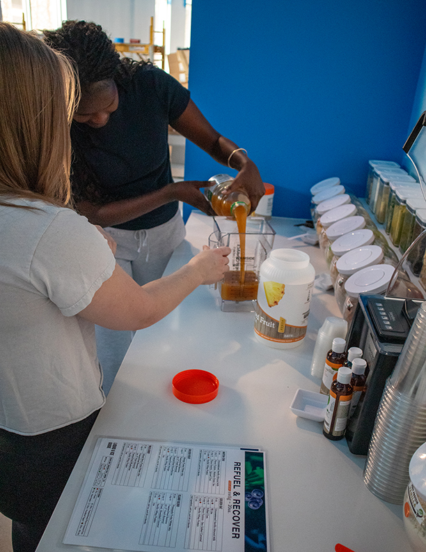
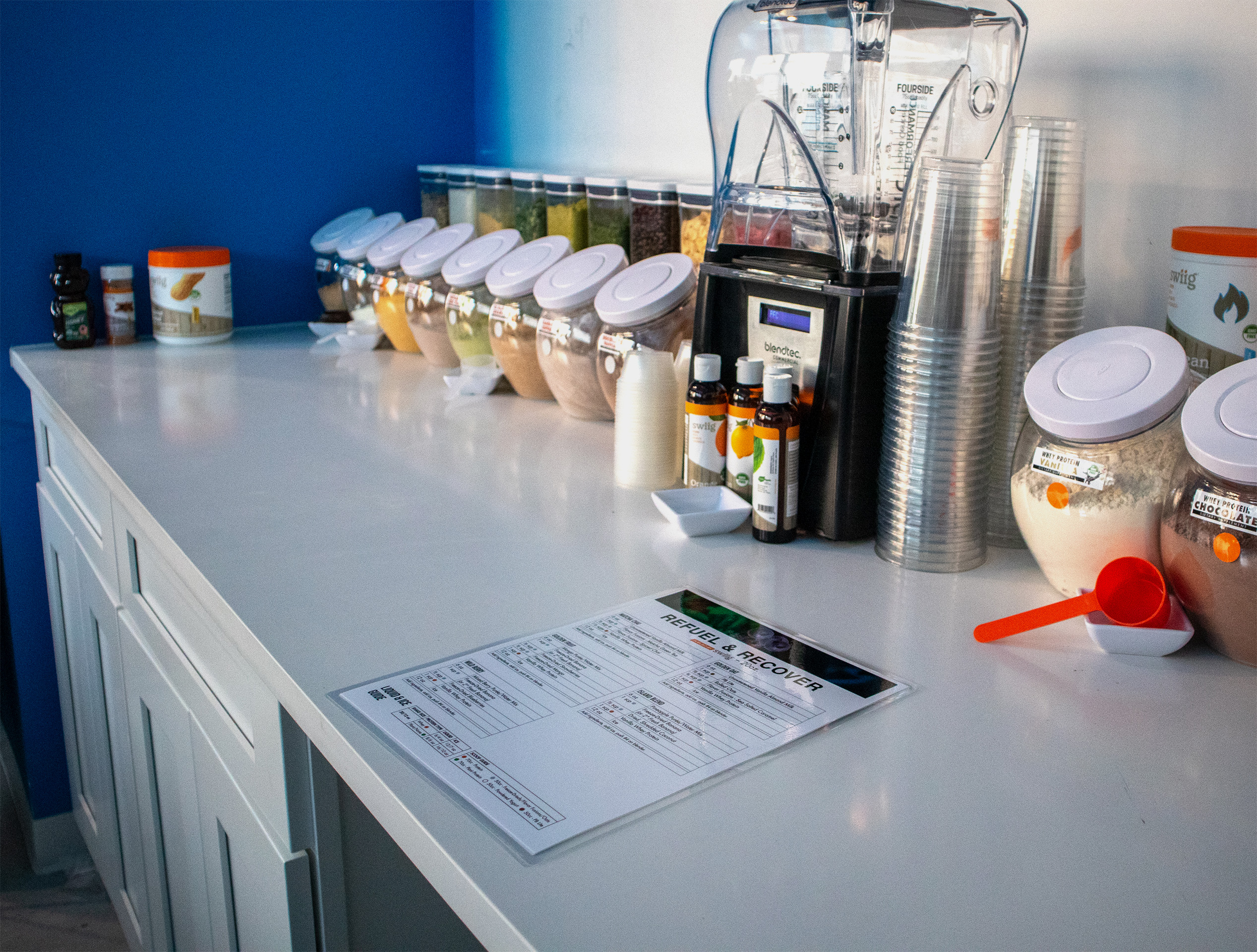
While working at Performance Food Centers, we gained a new customer in 2026: Spoke Society, a business in Fishtown, Philadelphia. They asked us to create digital and printed menus that matched their brand’s aesthetic. Following their unwritten brand guidelines for color palette, fonts, and logo usage, I designed a set of deliverables that fit their brand perfectly. I also joined the owner of Performance Food Centers at their staff training event. The Spoke Society team was thrilled with how their menus look, and they remain a satisfied client to this day!

Spoke Society supplied us with their color palette, which includes a balance of energetic and calming cool tones. I referenced their website and social media accounts to make sure that I was using the colors appropriately throughout the design process.

RUBBER
CMYK 73/67/65/81
RGB 20/20/20
HEX #141414

LIGHTNING
CMYK 18/0/20/0
RGB 202/255/220
HEX #CAFFDC

COOL DOWN
CMYK 51/0/22/0
RGB 104/219/215
HEX #68DBD7

REST
CMYK 83/45/0/0
RGB 2/125/201
HEX #027DC9

ELECTRICITY
CMYK 23/0/86/0
RGB 207/249/78
HEX #CFF94E
I identified Spoke Society's typefaces through prior knowledge gained from typography courses, and useful tools, like the Adobe Fonts identification system. They use a sleek, and easy-to-read combination of Helvetica Bold in all-caps for their headings, with Azeret Mono Light for subheadings and body copy.
Helvetica Bold
Aa Bb Cc Dd Ee Ff Gg Hh Ii Jj Kk Ll Mm
Nn Oo Pp Qq Rr Ss Tt Uu Vv Ww Xx Yy Zz
Azeret Mono Light
Aa Bb Cc Dd Ee Ff Gg Hh Ii Jj Kk Ll Mm
Nn Oo Pp Qq Rr Ss Tt Uu Vv Ww Xx Yy Zz
Seeing the deliverables in-person was a great experience for me during their staff training event. It gave me a great deal of confidence to see how cohesive the work I had done was with their physical space, and to receive a tremendous amount of positive feedback from the Spoke Society team!
Digital Menu

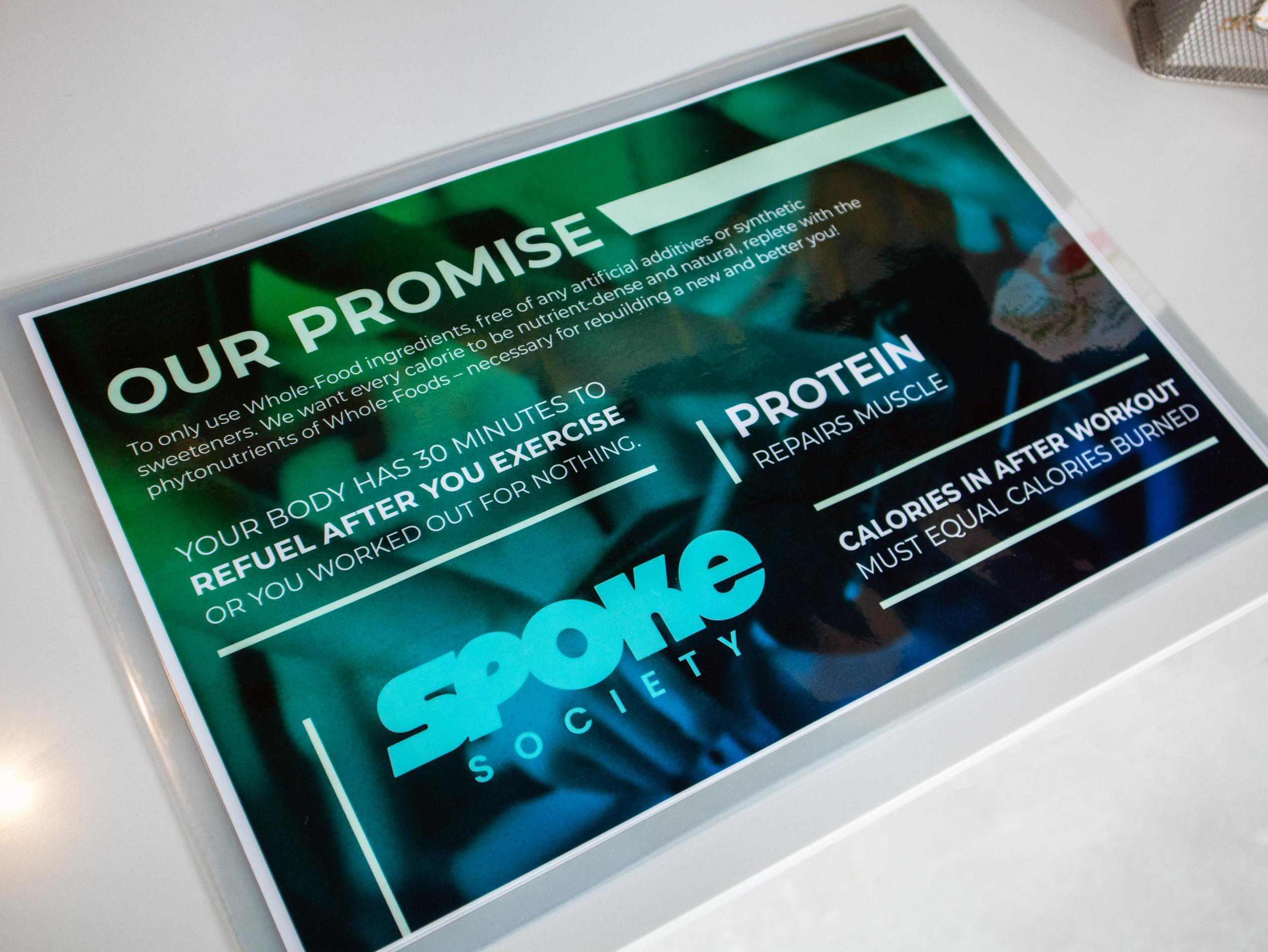
Shake Mats
.jpg)
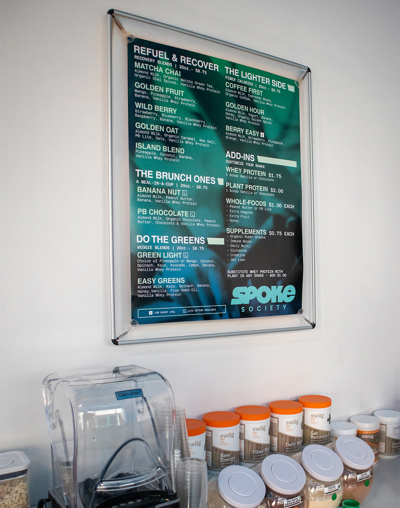
22" x 28" Menu

Recipe Cheat Sheets